
Inspired by Lada Adamic‘s excellent Coursera on Social Network Analysis I thought it might be interesting to try to graph the network of Twiplomats – the world leaders or diplomats on twitter. Simply to see who follows who, who the central nodes in the network are, and whether hubs or communities have developed.
By graphing everything at once, we can tell stories – or perhaps find some surprises – outside the individual account narratives told on Twiplomacy.com.
So, thanks to Matthias Lüefkens and the Twiplomacy team for providing all the data, which must have taken hours to collate and check, and to Damon Clinkscales for connecting me with the right bits of the data (as he’d already worked on Twiplomacy, this turned into a very small world), I attempted some basic social network analysis.
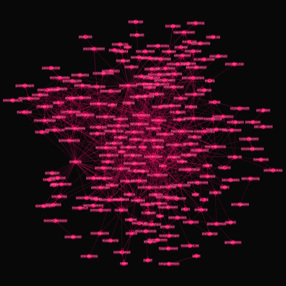
Firstly, it proved a little tricky to cram the data into the right formats for Gephi – an open-source network visualisation tool. But after much cursing and bouncing files between Excel and Gephi – all the accounts and links were represented. Laying out the graph according to a ForceAtlas algorithm helps show hubs and communities, and then a little manual adjustment brings in some of the stragglers (those who aren’t well connected). The result is this graph:
You can see a zoomable version of the graph on zoom.it, or view it as a PDF, which looks great. Unfortunately it can’t be embedded here (thanks WordPress!).
Each account is represented by a node on the graph, and each ‘follow’ is represented by an edge with an arrow to show who follows who. It’s obviously quite busy, but there’s instantly interesting stuff you can demonstrate with it. For example, you can roughly see three groups in the graph – upper left, upper right and the close-knit block in the middle:

These correspond pretty well to South America (and some Carribbean accounts), Africa, and then a mix of OECD (North America, Europe, NZ, Aus) countries. On the fringes of that central group (in the east!) are Russian, Central and South Asian accounts.
People that you might expect to span both groups do, sort of. For example, Mariano Rajoy, Spain’s PM, sits on the line between the OECD group and the South American group – showing the importance of shared language and history.
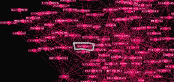
The middle of the graph is all a bit of a mess – but filter out those with fewer than ten connections, and it clears up – down to just seventy accounts. It’s no surprise that barackobama and whitehouse are there – everybody follows them – but number10gov is equally well linked. There are also some surprises in this data: Jens Stoltenburg is Norway’s PM – but by virtue of tweeting like a real person (engaging as well as broadcasting), he’s become very well connected. And it’s no surprise that Queen Rania is there too: humanitarian-celebrity-royalty goes down well on twitter.
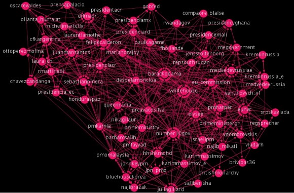
Strengthening the filter down to the 16 most connected accounts is interesting – there’s no real discernible ‘group’. Traditional powers are there – the US, Russia, France, UK – as well as Spain and the EU – but then some surprises from Mali, Costa Rica, Dom. Republic, Puerto Rico, Mexico and Chile. Trinidad makes it in as a compulsive follower of other accounts!

One benefit of using Gephi is that it can very quickly give you detailed statistical analysis on the network. For example, it can score nodes on ‘betweenness‘ – my favourite measure of centrality in a network. Nodes with high betweenness are the ones that could play the most important role in distributing a message in a network. The node with highest betweenness is the node that connects the most other nodes together in a network by the shortest route or path. The networker, if you will. The life and soul of the twitter party. The gossip-monger.

By this statistic, the number10gov account is the most central on twitter. This means, I think, that if someone tweets something worth retweeting, it’s likely to reach the rest of the network quickest through the UK account.
You might have thought someone like barackobama or whitehouse would score highly – but not so. While everybody follows them, they themselves don’t follow back. This means that they don’t actually pick up messages from much of the rest of the network – therefore there aren’t that many paths between two nodes in this network that go through the US. I think that’s quite interesting. It’s just one example of the stuff you can work out through network analysis. And with more and better data (and a better analyst) there could be loads of quite interesting things like this.
Limits of all this fun stuff:
If you’ve read the Twiplomacy report – or if you already follow some ‘world leaders’ on twitter – you’ll know that it’s a small minority of accounts that are using twitter like the rest of us – to share links, to reply to questions, to RT others. Many of the nodes in this network are accounts that simply broadcast news or links, or were set up during political campaigns and haven’t been used since leaders got into office (n’est-pas, M. Hollande?).
And the data was all gathered in July 2012, so it’s already partly out of date. For example, we’re missing the new Mexican president and a certain British PM. So clearly there are limits.
But this is more valuable than just looking quite pretty.
Governance is changing, but the movement towards open government is mainly being played out at national levels. At the international or global levels, governance is still pretty closed – diplomacy is still seen as something you do quietly away from public view. And there are probably some good reasons for this (although I’m not sure the reasons are as good as everyone seems to assume…but anyway…).
But as more and more individuals establish social media accounts – and it is the individuals that are particularly interesting, rather than the institutional accounts – suddenly their words are more public, their statements are permanently recorded and can be analysed by scholars, journalists and anyone else. We can see what kind of informal international networks are built – we can begin to see how someone might have influenced someone else. More openly than ever before.
Because social media is about people, and because I think transparency is about people, this is particularly revolutionary for the study of international relations. For decades, the study of international relations in academia has been monopolised by realist scholars – all game theory, absolute gains, relative gains, etc. It’s all fascinating Cold War era stuff, but you can’t help feeling like all these scholars forgot that it’s actual people that take decisions. People who are influenced by a whole range of factors that isn’t just a naked ambition for power. Studying this stuff earlier this year, I felt that constructivism – the label given to the type of writings that did make allowances for the more sociological stuff – wasn’t given enough attention. Hopefully Twiplomacy might inspire some new areas for academic study.
But this is important beyond academia too. Open global governance means holding global policy deliberation in the open, and giving everyone a chance to get in touch, argue with and persuade policy makers. All that lobbying – if held on digital platforms – is open and recorded, so that you can see and follow the patterns of influence. Social network analysis allows us to understand how a policy develops, who influenced it, and this transparency is part of more democratic decision-making.
Clearly the work above is a very early effort – but if digital diplomacy becomes increasingly important – i.e. the tools are used more and more for diplomacy by the individual actors), then this could become a serious field of research. And ultimately a development towards a more democratic global order.
What’s next?
Twiplomacy’s data only examines the social networks of international relations – but nations are no longer the only (or even the most powerful) element of global governance. We should be analysing networks of trade policy makers, transnational corporation lobbyists, bankers, regulators, leading civil society actors, and so on.
Graphs of social networks could be produced on individual global issues – showing the patterns and structures of those working on climate change, financial regulation, labour rights, etc.
Much more complex analysis could be done with the network. In the examples above, the edges just represent who follows who. There’s no weight to that edge: if X follows Y but never engages with them, it is shown in the same way as if X follows Y and constantly mentions and RTs them. The links between number10gov and whitehouse make the relationship look equal. It perhaps isn’t. Weighting the edges by mentions would transform the graph and would tell some great stories. This would require scraping even more data from twitter, in ways I have no idea how to do – if you do, please get in touch.
Gephi can also do dynamic analysis – so you could show new leaders joining the network over time, and watch how they made connections, and who they followed or followed them first.
Finally, of course, you could reject the idea of institutional power and of ‘world leaders’ altogether. You could argue that what matters is real people’s cross-border personal conversations with other real people. Peer-to-peer diplomacy. Elie Levasseur has a brilliant Prezi on the idea that he calls ‘User-Generated Diplomacy‘.
If you made it this far, well done. Any thoughts you have on further research or investigations – on different ways of representing the data – on other networks that should be examined – etc, are very welcome. There’s much more to learn…
And here’s a PDF of the first graph.


One reply on “Drawing the social network of digital diplomats”
I loved the combination of infographic, twitter, international relations, and most importantly pink nodes, Well done Joe. I would love to leave an intellectual comment, but it’s Sunday and I am tired. Definitely like the idea of a weighted graph, rather than simply charting who-follows-who.